VISUALISATIONS
WIPRO - SUMMER 2021
internship
Summer Internship 2021 - a one month project.
I worked on visualizing & illustrating concepts for presentation decks based on design-led innovation.
MY INTERVENTION
The use of colour psychology to choose a colour palette for every illustration.
MAY 2021 - JUNE 2021
SOLO
MY ROLE
ILLUSTRATION AND
GRAPHIC DESIGN INTERN
THE REQUIREMENT
Creating illustrations for concepts based on design-led innovation for inter-department meeting presentations. The aim was to help a viewer perceive and understand the textual information that goes into each slide, by providing visual aid.
MY PROCESS
one

two
THE KEYWORDS

three

four

five
STEP ONE
THE CONCEPTS
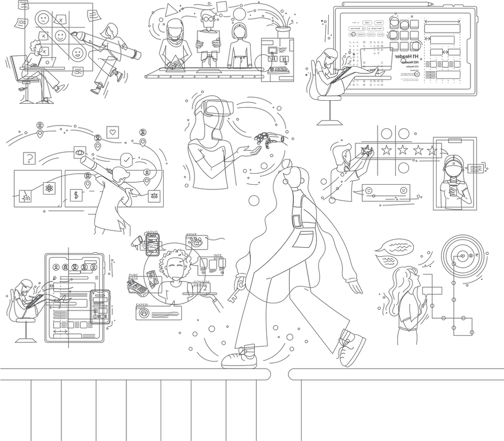
I was provided a set of 9 concepts based on the mentioned theme: design-led innovation. A set of words along with a description was also given, that explained what the concepts meant with respect to the Wipro scenario.
1. Designing for Behavioral Change
2. Unlock New Experiences with Us
3. Technology and Innovation
4. Service Design
5. Strategy Design
6. Visual Design
7. Customer Feedback and Stories
8. Meeting Customer Requirements
9. Customer Experience Design
STEP TWO
THE KEYWORDS
Analyzed the given descriptions to create a set of keywords that would help me ideate.

STEP THREE -> FOUR
THE CONCEPT SKETCHES -> FINAL VECTORS
HOVER TO SEE THE MAGIC


STEP FIVE
THE RIGHT COLOURS
Wipro’s brand colour palette consists of 7 main colours. Using these colours randomly across illustrations felt unreasonable. So I went about introducing the concept of involving colour psychology into these illustrations, to help convey the concept using both the illustrations and the chosen colours.

DESIGNING FOR BEHAVIORAL CHANGE
The tic-tac-toe is a common way to depict strategy. Here, the concept is made more interesting and concept oriented by adding elements like the smileys and the post it notes. The three emoticons in a row and the designer circling around it depicts a win. The designers have been successful is making unsatisfied clients into happy customers. The different coloured post-it notes depict sorting ideas and brainstorming, both very essentential steps to create a change.

SERVICE DESIGN
The designer is shown creating a user journey for the service. Opportunities are identified at various touchpoints and enhanced. A holistic approach that covers various different aspects of the service are also considered. Users are shown to be at different locations of the user journey, that shows that the path paved is easy to navigate through. Lastly, the touchpoints used are both user-centric and business driven.

TECHNOLOGY AND INNOVATION
The concept shows the character, our user, metaphorically interacting with the future of innovation by using the current technology of a VR headgear. In a small way, the illustration depicts two worlds, the real and the virtual, connecting. The lines going around create a sense of movement and make the contact feel dynamic , despite the two subjects being very static.

UNLOCK NEW EXPERIENCES WITH US
The concept shows how the character is stepping from a dull world, into a more exciting one, filled with colour. The new world is supported by 4 pillars of Customer Experience Design, Strategy Design, Service Design & Visual Design. The charcter is shown holding a key, as if she is about to unlock some amazing new experiences.


STRATEGY DESIGN
The speech bubbles depict feedback by users and other stakeholdets. The designer works on converting them into a meaningful solution. The solution acts as a metaphor for the future roadmap that helps us meet our goal. The main goal is shown as a mixture of both business and user goals. The notification on the phone that says ‘congratulations you‘re #1’ shows the competitive edge, and the fact that we have created a difference in the market.
VISUAL DESIGN
The shift from wireframe like looking dull screens to a colourful appealing version depicts the enhancement user experience accross interfaces. Responsiveness and sense of visual unity is portrayed by showing a phone version of the same interface. The profile avatars, depict conversion of clients to happy customers. Layouting line and measurements shown imply scalability of the platform as well.


CUSTOMER STORIES AND FEEDBACK
The user is shown giving feedback and a 4-star rating. The task of the designer is to add that 5th missing star, to iterate the designs and services for maximum customer satisfaction. A tic-tac-toe is used to showcase that it’s not always easy and that strategising is essential if one wants to improve.

MEETING CUSTOMER REQUIREMENTS
The service is metaphorically depicted as a machine, recieving customer requirements and wishes and converting them into products and services that they want. It shows promotion of user communication and consideration.

CUSTOMER EXPERIENCE DESIGN
The illustration shows a user journey with enhaced touchpoints. The overall interaction of the user with it’s surrounding shows that there exists an interconnection there. Usage of different devices shows that the service/product is responsive, flexible and userfriendly. Different aspects of the environment are aiming to forge a relationship.
